A website for a business starts with a question: what does the visitor need to understand and do? The answer influences the text, the design, the form and even the choice of pages. If this decision remains unclear, you can have a flashy interface that doesn't explain the service or forces the customer to search too hard for a contact.
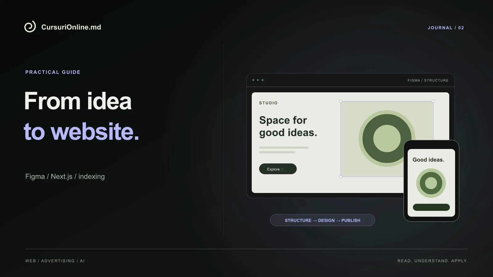
This guide presents a path to creating a website or landing page, from brief and Figma to Next.js, publishing and checking indexing. We use a hypothetical example of a local landscaping workshop. The goal is to understand the connections between the stages, then apply them to your project. It is also the logic of the direction Website and landing page on CursuriOnline.md.
Define the request you want to receive
"I need a modern site" describes a preference but doesn't say enough about the project. A useful brief states the audience, main service, work area, customer questions and desired action. For our workshop, the output can be a request containing the room type, location and approximate dimensions. Thus, the team starts the discussion with relevant information.
Separates required and optional elements. Portfolio, process explanation and contact can be essential. A complex configurator can wait until there are enough requests to understand what needs to be configured. This prioritization limits work without clear effect and makes the first version easier to check.
Also write an acceptance criterion: a new visitor must be able to identify the service and send a request from the phone. The criterion is more precise than "looking professional" because it forces you to test a full route. Design remains important, but it is evaluated in relation to a purpose.
Choose between a landing page and a multi-page website
A landing page organizes a main offer into a compact route. It can be suitable for a campaign, a well-defined service or the validation of an idea. A multi-page website provides space for different services, projects, articles and company information. It is not the number of pages that determines the quality, but the relationship between the structure and the audience's questions.
| Situation | Starting point | What are you checking? |
|---|---|---|
| Only one offer promoted | Landing page | The message of the ad continues naturally on the page |
| Several distinct services | Separate pages | Each service has its own explanations |
| Portfolio under development | Website with projects | You can add examples without redoing everything |
For the workshop, fitting out kitchens and refurbishing furniture may have different questions. If you cram them into one presentation, they both become vague. If you make two nearly identical pages for just two search terms, you're adding worthless maintenance. The structure must follow real differences in supply.
Prepare the content before the visual details
Start with an outline: main promise, who the service is for, examples, process, questions and contact. For each section, write down the question it answers. The portfolio shows the type of work, the process explains the steps, and the FAQ reduces confusion about materials or scheduling. If two sections respond identically, they can probably be merged.
Use photos for which you have the right to use and descriptions that reflect the actual contribution. A demonstration project must be presented as such. Avoid fabricated reviews and unsourced experience numbers. In the beginning, a few well-explained examples are more believable than a large gallery of images without context.
Write buttons that announce the next action: "Request an estimate" or "Discuss the project." If the button opens WhatsApp, the visitor must understand this. Don't use a payment or booking confirmed message when just opening a conversation. The interface text is part of the functionality, not a decoration added at the end.
Transform the structure into a coherent Figma design
In Figma, first build a simple version with text and content areas. Check the order of the information before choosing all the effects. It then sets a scale for titles, spacing, colors, and reusable components for buttons and cards. Consistent repetition helps the reader understand the page without learning a new pattern at each section.
Draw the mobile version as well. A title that fits on the desktop can take up five lines on the phone. A three-column comparison may need a different reading order. Think form states: empty, completed, error and confirmation. A prototype that shows only the ideal situation hides an important part of the project.
Animation can explain a relationship or indicate a change, but it doesn't have to constantly compete with the text. For a service site, an unobtrusive appearance and clear interaction feedback may be sufficient. In Figma dedicated page you find the context of using the tool in the course process.
Implement in Next.js keeping the sense of the design
When implemented, the page is divided into elements that have a role: navigation, main content, sections, lists and form. Headings should form a logical hierarchy and links should be keyboard-friendly. A button drawn in Figma becomes a real control with accessible text and a verified destination.
Next.js differentiates server-rendered components from those that need browser interaction. The documentation on Server and Client Components explains this delimitation. Basically, a presentation text should not be treated the same as an interactive calculator; the decision influences the delivered code and data organization.
Test with real texts and longer content than the original example. If a card breaks when the title has two rows, the component is too rigid. Preserves image proportions and checks for temporary missingness. A robust website must remain intelligible even when the network is slow or some data is not immediately available.
Build SEO into the page, not just into the metadata
An SEO title and description are helpful, but they are no substitute for a page that answers the visitor's question. Use clear names, easy-to-understand addresses and links between relevant pages. An article about material selection can link to the right service, and the service page can provide access to a project explained in detail.
For each page, check the main title, description, canonical URL and share image. In Next.js, this information is organized through the Metadata API. Structured data must describe visible content; don't add reviews or offers that don't exist on the page.
The Google Search Central guide explains the role of useful content and accessibility for search engines. For our project, the application starts with service explanations, relevant photos and a readable structure. Artificially repeating the phrase "creare website Moldova" does not fix the lack of information that a client needs.
Publish a version you can control
Before release, check domain owner, project access, and who can publish changes. Use a preview version for review and keep a version you can return to. Publishing should be a repeatable step, not a mysterious operation that only one person can do.
Browse the website on phone and desktop. Submits a test form, verifies its receipt, and deletes the demo data from the actual workflow. Open external links, menu, contact and pages that do not exist. A proper error page is more useful than sending all unknown addresses to the first page.
Tools like Vercel help with publishing, but the existence of a successful deployment does not prove that the entire path works. After release, repeat the test on the public domain. The configuration, form addresses or redirects may be different from the environment in which you worked.
Check indexing without confusing it with positioning
After publishing, check that important pages can be accessed, that the sitemap contains the correct addresses, and that you did not accidentally keep a no-index rule. In Search Console you can inspect a URL and investigate the reasons why it does not appear in the index. A sitemap helps with discovery; does not represent a promise of inclusion.
Google states that request a recrawl does not guarantee immediate indexing. It separates three things: the page is public, the page is discoverable, and the page appears for a specific search. Each stage has different checks and repeating the request is not a substitute for fixing a technical or content problem.
Keep a simple log of changes. Write down the address, the problem observed, the intervention and the date of the next check. This habit prevents chaotic changes and helps you compare situations. If you've published five pages in a week, it's more useful to understand each URL than to just track a total figure.
Exercise: a small website, checked from end to end
Choose a service and prepare a page with offer, three examples, process and contact. Write the brief, make the desktop and mobile Figma variants, then deploy and publish. Ask someone who doesn't know the project to explain what you have to offer and figure out the next step. Notice where he hesitates without explaining the interface instead of the page.
- Check the readability of the title and buttons on a narrow screen.
- Submit a complete inquiry and confirm where it ends up.
- Control SEO title, share image and internal links.
- Write down what you've checked for publication and Google discovery.
This path gives you a foundation for an online store or Google advertising. If you want to follow it in a structured order, consult the course syllabus Website and landing page. The important thing is to be able to explain the result and repeat the process, not just reproduce a beautiful shot.